To ensure branding consistency across your company and Documoto instance, administrators can use Styles to achieve that goal. This article walks you through the steps to manage brand images and additional Documoto style elements.
Article Topics
How to Add Logos & Apply Styles
Option 1 (Tenant/Site Level)
- Within Documoto Admin go to Library Admin > Styles to set up images and desired colors
Option 2 (Organization Level)
- Within Documoto Admin go to Users > Organizations > select organization > Library > Styles to set up images and desired colors
Available Imagery
- Main Logo: Image that will display in the upper left corner of the Documoto application as well as the login page
- eCommerce Logo: Image that will display in HTML Order Management forms, provided Template Header Fields are configured
- Print Logo: Image that will display for printed parts books
- Login Background: Background image for your tenant/site login page
- Library Banner: Image that will displayed as a header behind the search in your Documoto library
For a complete listing of all recommended image sizes and specifications in Documoto, refer to: Imagery and Thumbnails.
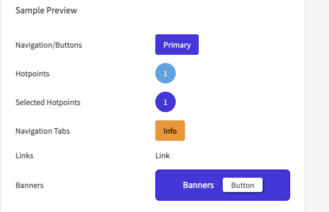
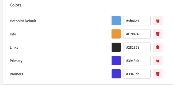
Colors & Preview
Colors are defined via hex color codes or the included color picker feature, which can be accessed by selecting the color preview box.
- Primary: the main color that will be present throughout your tenant, including:
- Buttons: Search, Filters, Submit/Send, Table of Contents, Post Comment, Add (to cart in Part Info)
- Hover and Select: Hotpoint hover, Hotpoint select, part row select
- Hotpoint Default: the color of hotpoints that are not selected or highlighted
- Links: the color of any link within the Documoto library as well as:
- Pagination Buttons: in Search Results, Orders, Related, and Where Used
- Selected Viewer Tab: for any content
- Info: this color applies to:
- Highlighted Parts: hotpoints and corresponding BOM rows for items with a tag that has the highlighted property
- Indicators: within the Bill of Materials or Table of Contents
- Information Notification: numerical indicators of information for tabs in content viewers
- Banners: this color applies to the Equipment Verification Banner on Part Item Details (if enabled).
The editor also includes a preview feature that updates in real-time as you assign colors. Once you've settled on your color scheme, click Save to see the live changes and refresh your browser